OOM Factory All work
OOM Factory/Work/Clean Slate Engine

Case Study · 2026

Clean Slate Engine

Making record-clearing casework
easy to read and act on.

Role UX Designer
+ Front-end Developer
Scope UX redesign, prototyping,
implementation, responsive
Stack React, MUI
Client The Access Project

Clean Slate Engine helps legal aid attorneys and law firm volunteers clear clients' criminal records. The engine worked, but the interface made it hard to tell where a case stood — or what to do next.

The Access Project brought me in to fix the UX. Status, actions, and case details were spread across tabs, banners, and a row of competing buttons. New users had a steep learning curve, and attorneys spent too long moving each client from intake to finished paperwork.

I worked through the redesign as clickable prototypes in Claude Design, then wrote the code to implement it myself. Each case is now organized around a clear progress model — analysis, attorney review, forms — with status visible on every case in the list. Along the way I made the app fully responsive and brought the UI in line with MUI, so the team can keep building on consistent components.

The result: new users learn the tool faster, and attorneys move from intake to generated forms much more quickly.
01 The redesign
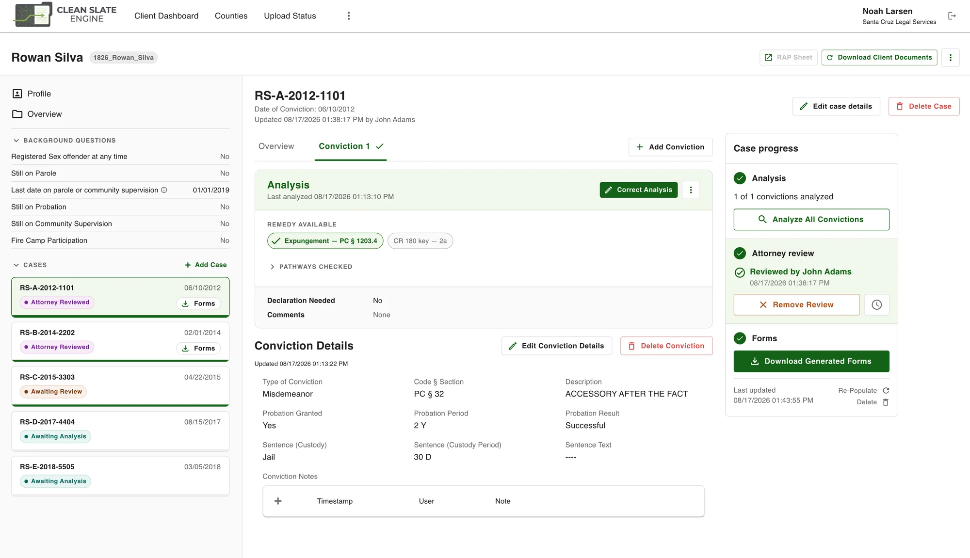
Redesigned case view with conviction analysis and a case progress panel
01 Each case now has a progress panel — analysis, attorney review, forms — with the next action right where it's needed. The analysis surfaces available remedies up front, with conviction details below.
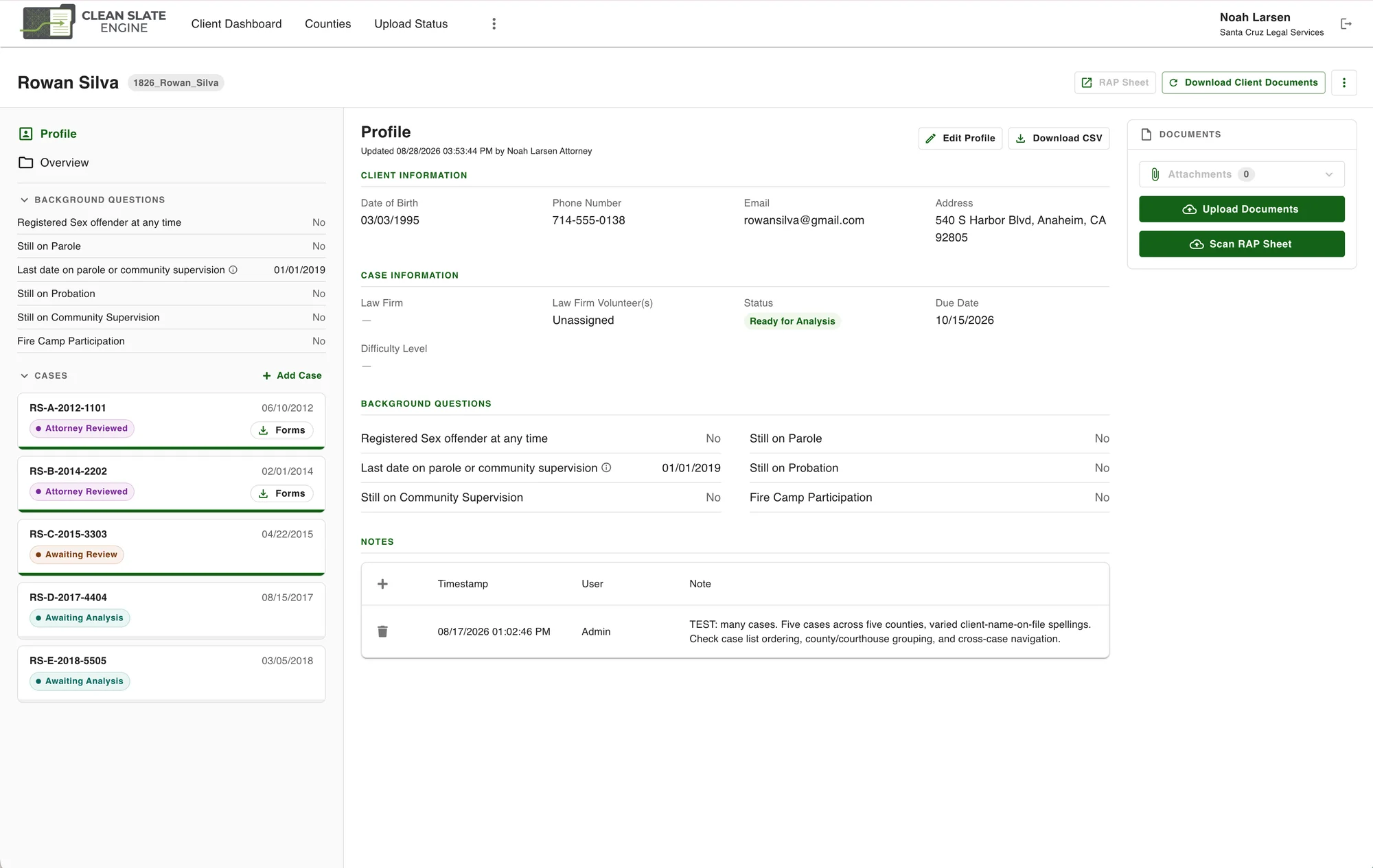
Redesigned client profile with grouped sections and a case list showing status badges
02 The client profile groups fields into client, case, and background sections. The sidebar keeps background questions in view and lists every case with its status, so an attorney can see the whole client at a glance.
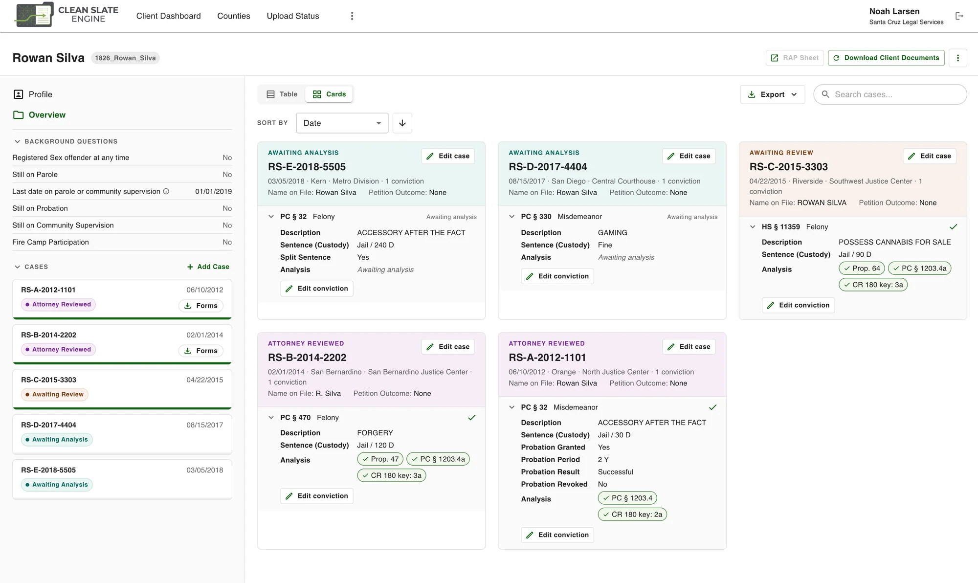
Cases card view showing each case's status and analysis results
03 A card view lays out every case side by side, color-coded by status, with each conviction's analysis results shown as chips — the quickest way to see what's ready, what's waiting, and what each client is eligible for.
02 Before & after
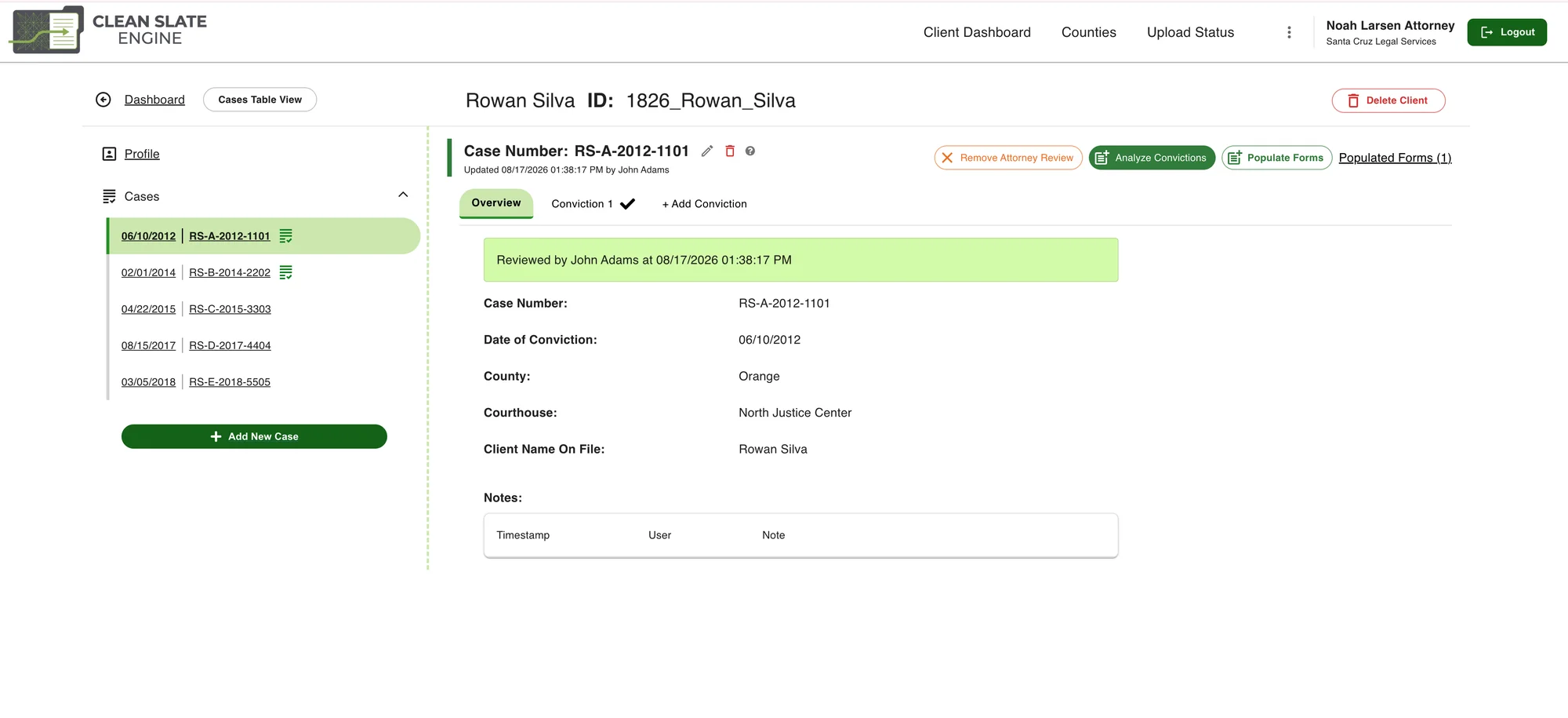
Before Original case view with a row of action buttons and a review banner
After Redesigned view of the same case with a case progress panel
04 The same case, before and after. Analysis, review, and form generation used to be separate buttons in a row, with progress shown as a banner and no cue for what came next. Now they're steps in one panel, each with its action in place.
"

Same engine, clearer path — from intake to generated forms without guessing what comes next.

— The goal of the redesign

Case study

Reveal AI ↗

Helping a services company become a product company.

Case study

Photobucket ↗

Shipped what two teams couldn't.